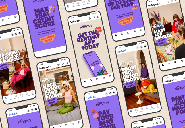

We’ve updated our logo, wordmark, typeface, photography, colours and illustrations. We also updated our website landing pages, in-app messaging and email flows. Finally, we made more than 40 pieces of creative (and counting) with our new look. Early feedback has been amazing.
After speaking to renters, we learned that our smart, savvy, responsible and financially astute target market wanted to use a payments service that was trustworthy, honest and empowering. Rent is a lot of money and integrity, and trust is everything.
It wasn’t enough to demonstrate great functionality and features. We needed to proudly communicate our higher purpose of helping renters to get more for their rent money and helping to develop excellent financial habits in the process.
Inspired by the design heritage of protest posters, we engaged Melbourne-based design studio, A Friend of Mine to propose a type-driven identity called “The Renters Champion”. The new look allows us to make bold statements on behalf of renters and helps us stand apart from our competitive set.
We engaged artist Anna Kosevecs (Monacle, IKEA) to illustrate empowering renter motives that we could use in our communications, and we shot real renters in a real rental in Melbourne’s north. A video crew captured people using the app, and it was important to us to demonstrate racial, age, gender and body diversity.
We also needed to align RentPay more strongly to our 15-year heritage at Rent.com.au, and we did some cool colour palette work to align the brands.

Our analysis of renters in Australia showed that you can’t beat the reach of Facebook and Instagram. Despite losing share to platforms such as TikTok and Snap, Facebook still dominates on reach.
Our plan was to balance storytelling with communicating RentPay’s key benefits. We know people convert better when emotionally engaged, so we opted for a mix of hero video and static follow-up posts.
Our hero video gives renters a sense of what RentPay is, and then after viewing 3 seconds of the video, renters are then served static posts describing the benefits.
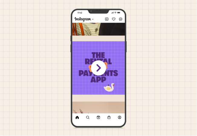
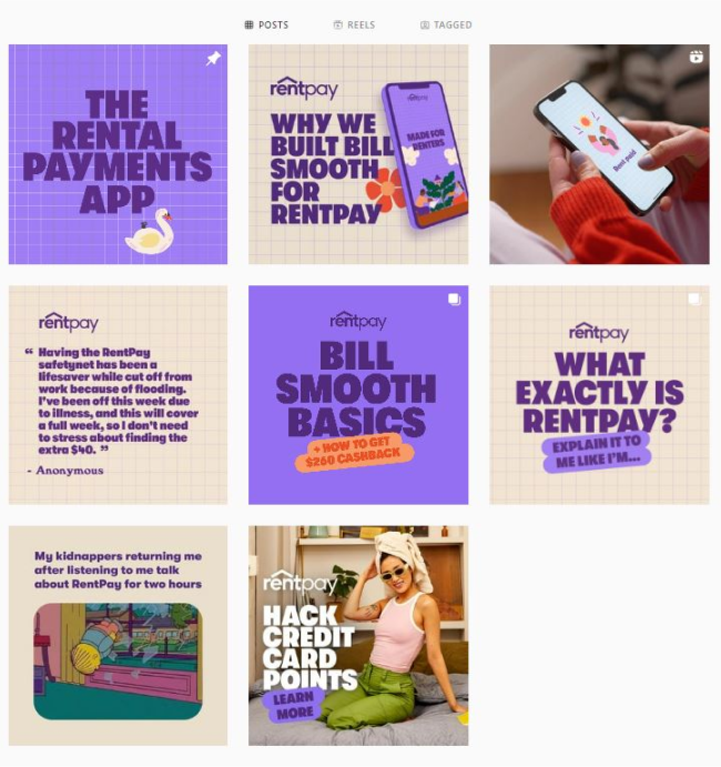
We’ve also reworked the organic grid for RentPay and Rent.com.au so that users can see timely, relevant and valuable content when they look us up pre-purchase.
You might also like:
> No ledger? No worries! 5 ways to boost your financial cred with a landlord
> The 30% rule: How much can I afford to spend on rent?
> Can I improve my credit score by paying rent on time?
With the meteoric rise of TikTok, we executed a test-and-learn approach to see how we might engage renters authentically on the channel. While we’re able to reach a young, tech-savvy demographic very cost-effectively, short-form video dominates, requiring a different production approach.
Early results show us well exceeding average CTR benchmarks on TikTok, but we’d like to increase our use of low-fi content utilising real renters talking to financial habits. We think content that is useful and valuable is important to our community.


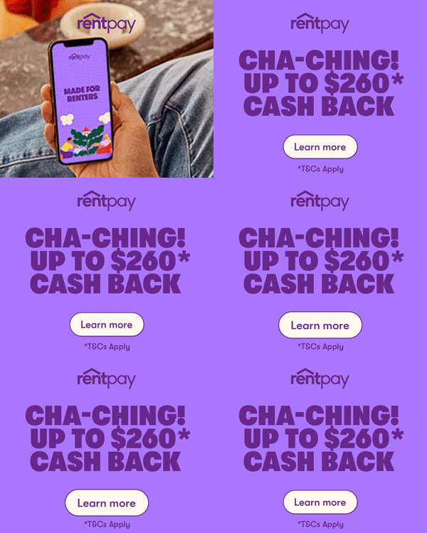
Since implementing the new look, we’ve seen a 70% increase in CTR on our in-house programmatic banners, with the same product showing that our renters like and trust our new look.
We understand that renters are just one piece of the puzzle. Real estate agents also play a crucial role in our target audience and offer tremendous growth opportunities for RentPay.
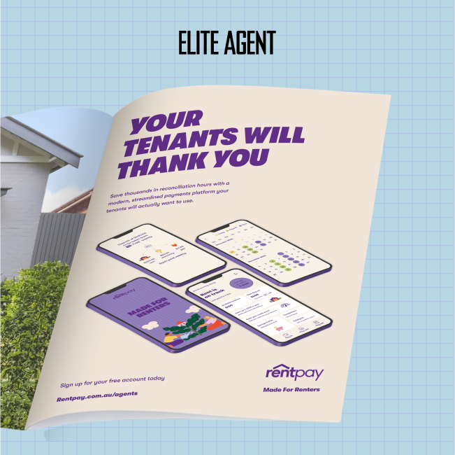
We've been working with the real estate media and news source, Elite Agent, to increase brand awareness among agents.
Through online and print campaigns, we’re working to educate agents on the potential of RentPay as a seamless payment solution for their business and encourage them to onboard their tenants.
By utilising these five platforms, we’re increasing brand awareness, consideration, traffic and conversion.
Next up, we’ll be expanding our media strategy capabilities by partnering with Group M, a large and extremely talented media agency, to help us propel RentPay forward.
Get ready. There are even more exciting things to come.